
Tuesday, November 4, 2014

Project Proposal
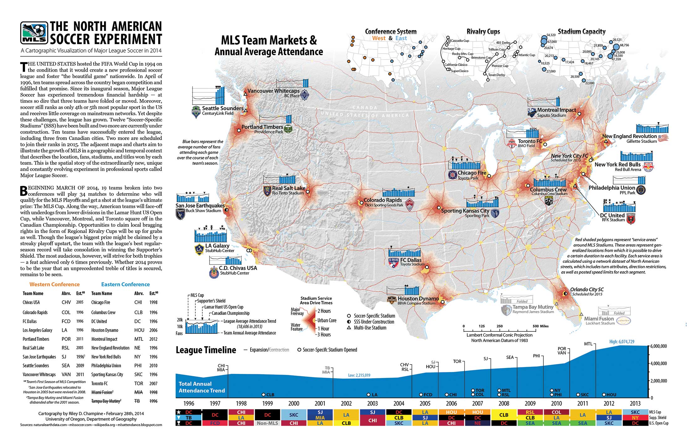
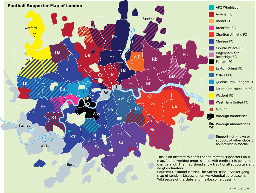
The subject of my map will be mapping all 20 soccer teams in the Barclay's English Premier League. I want to map the location of these teams for an American Sports fan audience, who probably doesn't know anything about English soccer culture. For example there are 5 teams in London alone! There is a lot of data I could find for each club. One interesting factor could be player payroll, stadium capacity, or trophies won in a time span (you can win more than 1 trophy in a season). Below is a really complex map that somebody created of all the clubs of MLS. I cannot make anything this awesome, but there are a lot of ways I can fit data. All I will need to start will be a base map of England and Wales (can't forget Swansea!) and maybe a base map of the city of London in case I cannot fit all the London clubs on the bigger map.

Thursday, October 30, 2014
Blog Map Post #6: Color

Wednesday, October 29, 2014
Blog Map Post #5: Chloropleth

Blog Map Post #4: Campus Map

This may be one of the most complicated college maps ever. But it is mostly because there is so much that you have to fit! UT Austin is a HUGE campus! When I visited Austin I walked around campus for a couple of hours, only to realize I didn't see anything close to most of the campus. I also like the 3-D aspect of the map. The buildings with unique architecture and of larger size stand out, as they do when you are standing on campus.
Blog Map Post #3 Type

Blog post 2
I've been slacking on these...
 This is an Equidistant Conic projection. I chose it because it looks nice on the web, but a paper Conic map is a pain. There is no easy way to fold it! However they are fairly accurate.

Subscribe to:
Posts (Atom)