
Thursday, December 11, 2014
Monday, December 1, 2014
Map Blog Post #10 Bivariate
 I think this is a very interesting Bivariate map. Proportional symbol and dot density are not commonly combined. Also the dots are separated into two categories and different colors and shapes. Does this then make it a trivariate map? I am assuming it is an older map because it is making an estimate of what the population will be in the 1970 census. I do not think the dots should be colored red with the orange proportional symbols because it blobs a bit. I would have used blue or green for contrast.
 Map Blog Post #9 Dot Density

Tuesday, November 18, 2014
Lab 10 Bivariate

Thursday, November 13, 2014
Map Blog #8:Isoline
This map is from the Texas Water Development Board. I see more of what is wrong with this map than what is right. First, the lines themselves are very rectangular and straightedge. I don't like the lack of curvature, but also the stroke of the line is too bold and it overwhelms the county and city boundaries. Also the number cutoffs are at strange intervals, especially in the East. The color guide is good but the shades of blue are too similar. 60 inches makes a very small section that you cannot even see. If it the intervals were grouped around 6-8 inches it would make the map flow easier.

Tuesday, November 11, 2014
Map Blog #7 Symbology

Lab 9 Dot Density

Tuesday, November 4, 2014

Project Proposal
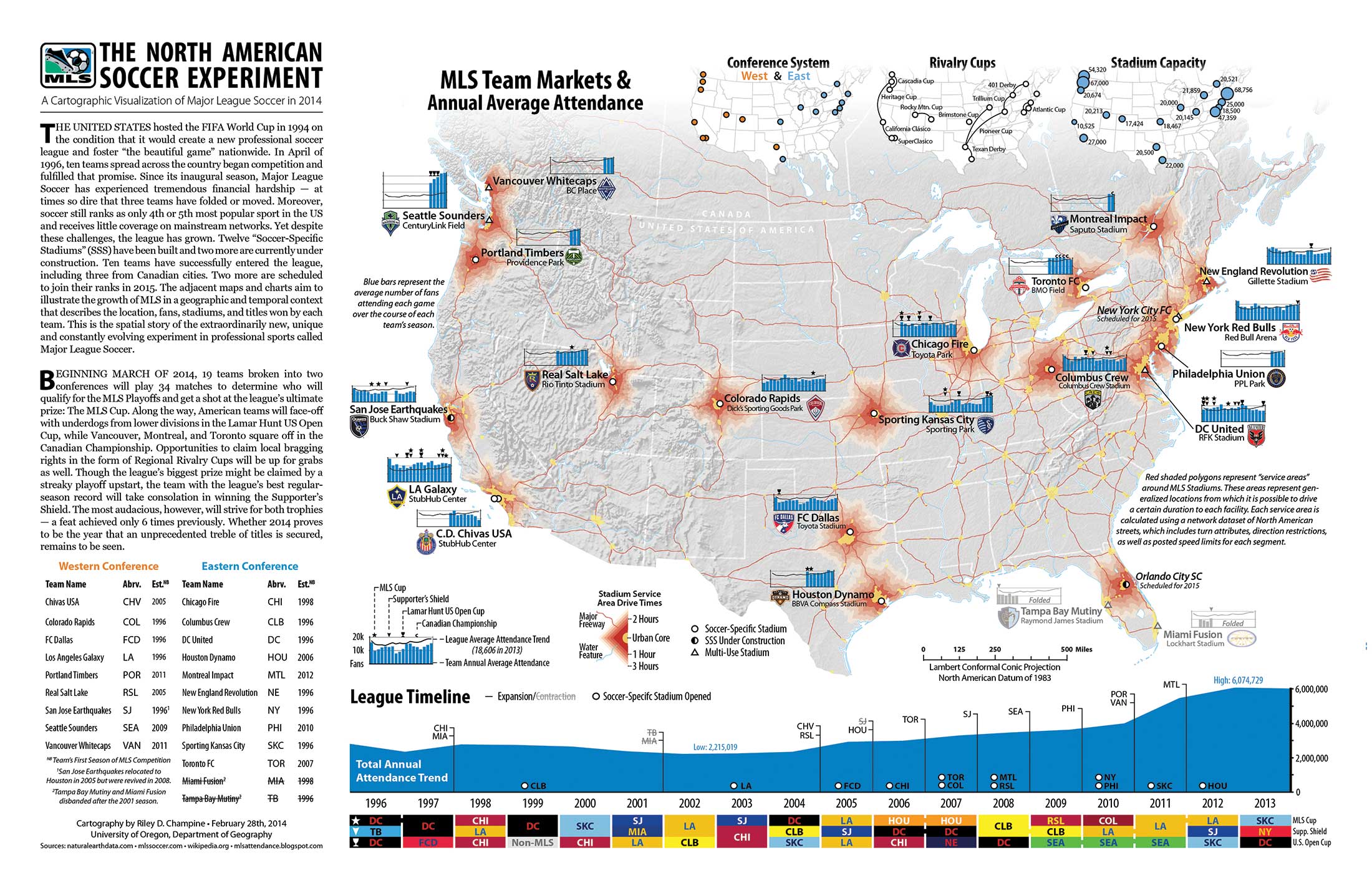
The subject of my map will be mapping all 20 soccer teams in the Barclay's English Premier League. I want to map the location of these teams for an American Sports fan audience, who probably doesn't know anything about English soccer culture. For example there are 5 teams in London alone! There is a lot of data I could find for each club. One interesting factor could be player payroll, stadium capacity, or trophies won in a time span (you can win more than 1 trophy in a season). Below is a really complex map that somebody created of all the clubs of MLS. I cannot make anything this awesome, but there are a lot of ways I can fit data. All I will need to start will be a base map of England and Wales (can't forget Swansea!) and maybe a base map of the city of London in case I cannot fit all the London clubs on the bigger map.

Thursday, October 30, 2014
Blog Map Post #6: Color

Wednesday, October 29, 2014
Blog Map Post #5: Chloropleth

Blog Map Post #4: Campus Map

This may be one of the most complicated college maps ever. But it is mostly because there is so much that you have to fit! UT Austin is a HUGE campus! When I visited Austin I walked around campus for a couple of hours, only to realize I didn't see anything close to most of the campus. I also like the 3-D aspect of the map. The buildings with unique architecture and of larger size stand out, as they do when you are standing on campus.
Blog Map Post #3 Type

Blog post 2
I've been slacking on these...
 This is an Equidistant Conic projection. I chose it because it looks nice on the web, but a paper Conic map is a pain. There is no easy way to fold it! However they are fairly accurate.

Tuesday, October 28, 2014
Lab 7

Wednesday, September 24, 2014
Lab 3
This is a map that I replicated of Harper's Ferry National Historical Park. This was an exciting lab for me because of my familiarity with the area.

Tuesday, September 16, 2014

Wednesday, September 10, 2014


Subscribe to:
Comments (Atom)